


New Look. Same Boomsatsuma.
After 15 years of championing creativity and opportunity for young people, we’ve unveiled a bold new brand identity. A new logo, a brighter suite of colours, new fonts and a new website, all designed to match the ambition, energy and innovation that runs through everything we do.
Why we did it
This brand refresh is about much more than a new logo. It’s about building a visual identity that represents who Boomsatsuma is now, and where we are heading next.
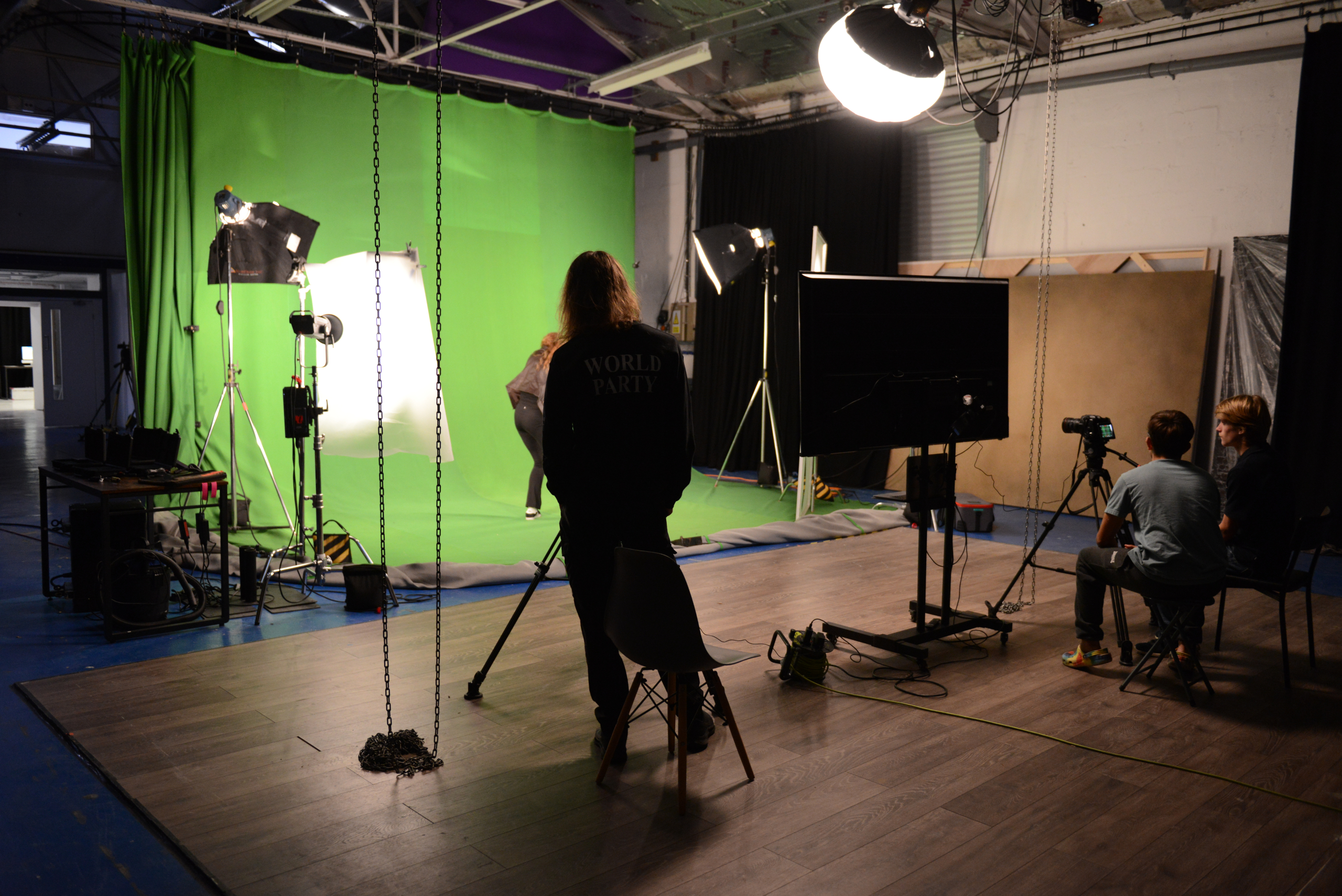
In the past 15 years, the organisation has grown to a thriving creative community, now supporting hundreds of students across a wide range of disciplines. The new visual identity marks this progress and gives Boomsatsuma a fresh, confident look that matches its ambition.
A strong brand also brings clarity and a sense of belonging, something that has always been at the heart of Boomsatsuma’s culture. This refresh helps strengthen that even further, giving students, team members and our industry partners a clear, shared identity to take forward.
As Boomsatsuma continues to grow and evolve, our new look is designed to grow with it.

“Our current brand has served us well, but it no longer captures the full ambition and breadth of what we do, I’ve always been incredibly proud of the work we do here and the impact we make and now we have a brand that shouts as loud as we do.”
Mark Curtis, CEO and Founder
As the organisation continues to grow; supporting more students, delivering new courses and driving even more exciting projects — we need a brand that’s adaptable, cohesive, and built for the future. One that communicates our boldness, creativity, credibility and relevance.
How we did it
Student and alumni focus groups and staff feedback sessions were such a critical part of the process, from the beginning we wanted to ensure that our new identity was true to our community and resonated with the people who embody Boomsatsuma every day.
We couldn’t have done it without our talented collaborators Styles Studio and Jay Burt who worked tirelessly to bring the essence of Boomsatsuma to life through branding and our new website.
The result
The new brand is bold, memorable and versatile and is built to grow with us.
- A new capital ‘B’ signals a new era and a proud statement of our identity.
- Our refreshed logo features distinctive typography with a sense of lightness and motion; the positioning of the double ‘o’ visually suggesting lift and transformation, mirroring a student’s journey through Boomsatsuma.
- The new colour palette is brighter and more dynamic, reflecting creativity and energy.
- New fonts, sub-logos and a redesigned website bring cohesion and clarity across everything we do.

“This new logo feels alive, just like Boomsatsuma. It captures the creativity and ambition that run through everything we do here. It is bold, creative and full of energy, it reflects what we’re all about.”
Daisy Dobson, Marketing Manager
To the future!
We’re really excited to share our new brand, it marks an important moment for us and the students we work with.
It’s also given us a chance to take stock. Over the past 15 years, Boomsatsuma has grown from a small idea in Weston-super-Mare into something that now supports hundreds of students across a wide range of creative courses and projects. This brand refresh is a way of recognising that journey and making sure our identity reflects where we are today.
More importantly, it’s about where we’re going. For our students, this is a chance to remind them we are bold, relevant and connected to the industries they’ll step into.


